27Visualization Reference for Creel Survey Estimates
Author
Christopher Chizinski
Keywords
creel survey, fisheries, design-based inference, R, tidycreel, Quarto
Estimation chapters (12–16) introduce each plot type in the context of a specific estimator. This chapter collects the key visualization patterns in one place as a reference for analysts building reports or adapting code for a new survey. Every plot uses the 2022 Harlan Reservoir data; the same patterns apply to any survey run through creel_design().
The chapter is organized by visual goal rather than by function. Each section shows the core ggplot2 code with real estimates, notes when to use each plot type, and identifies where the underlying estimator is introduced. Cross-references point to the chapters where each estimator is first developed.
27.1 Effort visualization
Effort plots answer two questions: how much fishing occurred, and is that effort distributed evenly across strata and time periods? Three plot types cover most reporting needs: a stratum comparison with confidence intervals, a monthly time series, and a paired comparison that shows both absolute effort and proportional distribution.
Effort by stratum with confidence intervals
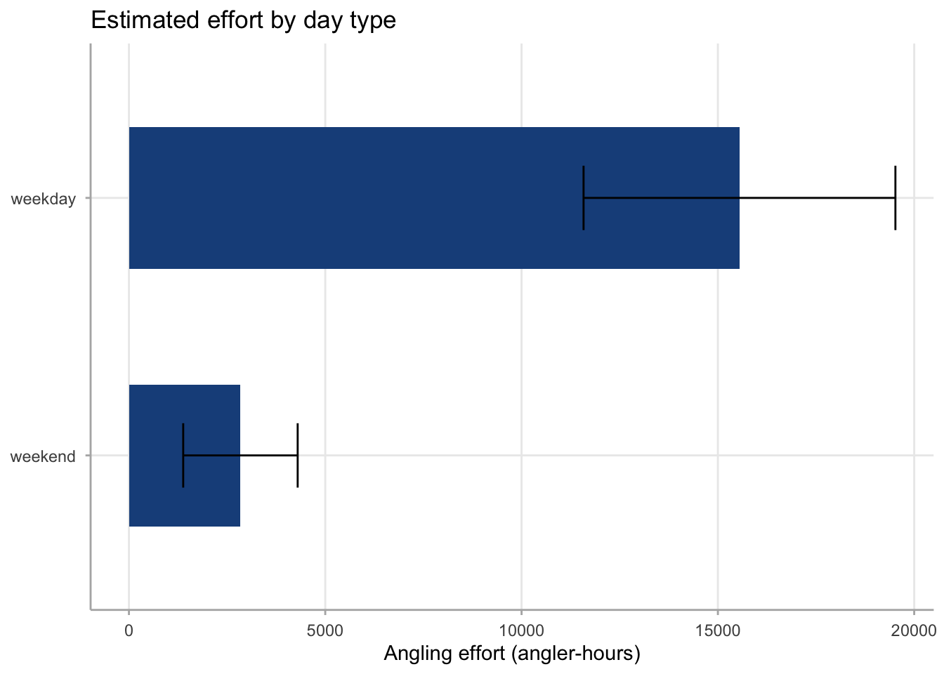
The most common effort summary is a bar chart comparing effort across strata — typically weekday versus weekend — with 95% confidence intervals. Displaying the CI is essential: effort estimates carry substantial uncertainty, and a bar chart without error bars overstates precision. See Section 21.9 for the underlying estimator.
Code
effort_by_stratum |>mutate(day_type =fct_reorder(day_type, estimate)) |>ggplot(aes(x = estimate, y = day_type)) +geom_col(fill ="#1B4F8A", width =0.55) +geom_errorbarh(aes(xmin = ci_lower, xmax = ci_upper), height =0.25) +labs(x ="Angling effort (angler-hours)", y =NULL,title ="Estimated effort by day type") +theme_creel()
Warning: `geom_errorbarh()` was deprecated in ggplot2 4.0.0.
ℹ Please use the `orientation` argument of `geom_errorbar()` instead.
`height` was translated to `width`.
Figure 27.1: Estimated angling effort at Harlan Reservoir in 2022 by day type, with 95% confidence intervals. Weekday effort substantially exceeds weekend effort in absolute terms, consistent with Harlan’s rural location where mid-week fishing dominates total seasonal pressure (see Section 21.9). The confidence intervals for the two strata do not overlap, indicating a well-detected difference between day types in total seasonal effort.
Monthly effort trend
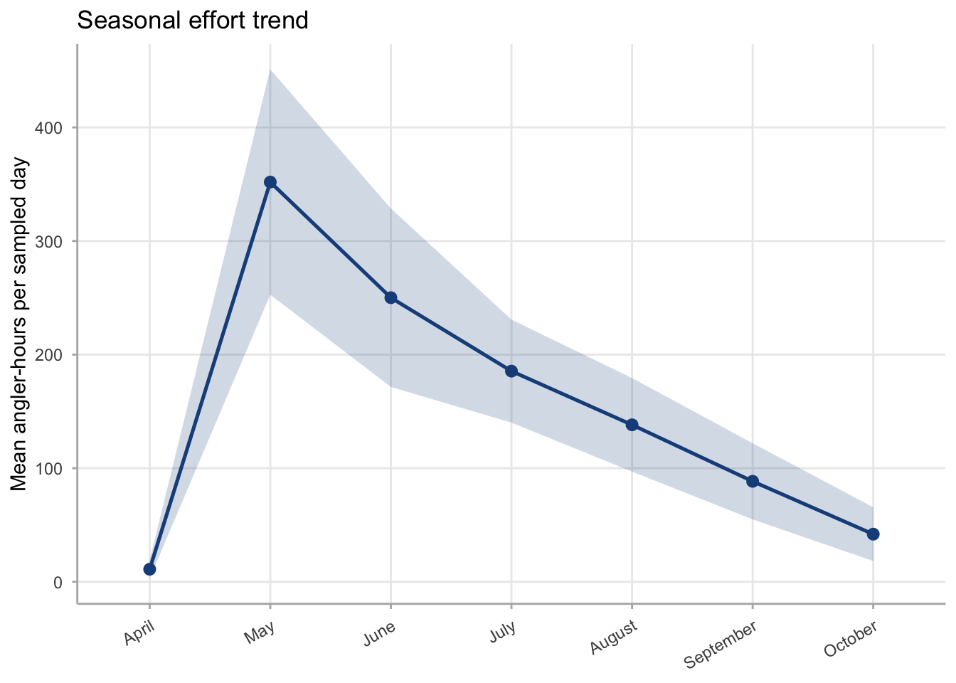
A monthly time series reveals seasonal patterns — peak months, slow periods, and any unusual dips. estimate_effort(by = "month") groups estimates within the season. Plot as a line with a shaded ribbon, not a bar chart: the ribbon communicates that the CI is continuous across time, not a discrete interval per bar.
Code
effort_by_month |>mutate(month =factor(month, levels = month.name)) |>ggplot(aes(x = month, y = mean_ah, group =1)) +geom_ribbon(aes(ymin = lower, ymax = upper), fill ="#1B4F8A",alpha =0.2) +geom_line(colour ="#1B4F8A", linewidth =0.9) +geom_point(colour ="#1B4F8A", size =2.5) +labs(x =NULL, y ="Mean angler-hours per sampled day",title ="Seasonal effort trend") +theme_creel() +theme(axis.text.x =element_text(angle =30, hjust =1))
Figure 27.2: Mean angler-hours per sampled day by month at Harlan Reservoir, April–October 2022, with approximate 95% confidence intervals (mean ± 1.96 SE across sampled days within each month). Effort per sampled day is lowest in April and October and peaks in June–July, consistent with seasonal angling participation patterns at Harlan.
27.2 Catch, harvest, and release visualization
Harvest and release estimates carry the same confidence interval structure as effort. The key plotting decision is whether to show them separately or combined. A combined three-metric plot helps readers see the partition between harvested and released fish without needing to add numbers mentally. See Section 22.8 for the estimators underlying these plots.
Combined catch, harvest, and release
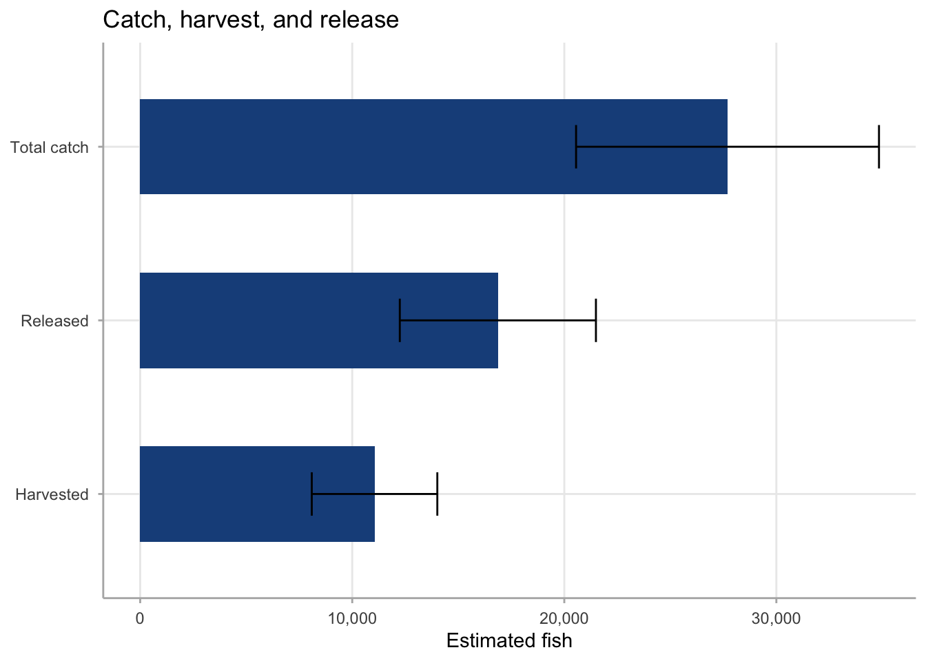
Plotting total catch alongside its components (harvest and release) reveals the relative importance of each disposition type. A horizontal bar chart works well here: the three estimates share the same unit (number of fish), and sorting by magnitude makes the partition immediately clear.
Figure 27.3: Estimated total catch, harvest, and release at Harlan Reservoir in 2022, with 95% confidence intervals. Catch is the sum of harvest and release; plotting all three makes the partition visible. Released fish substantially outnumber harvested fish, indicating a catch-and-release-dominant fishery for the species sampled.
Harvest by stratum
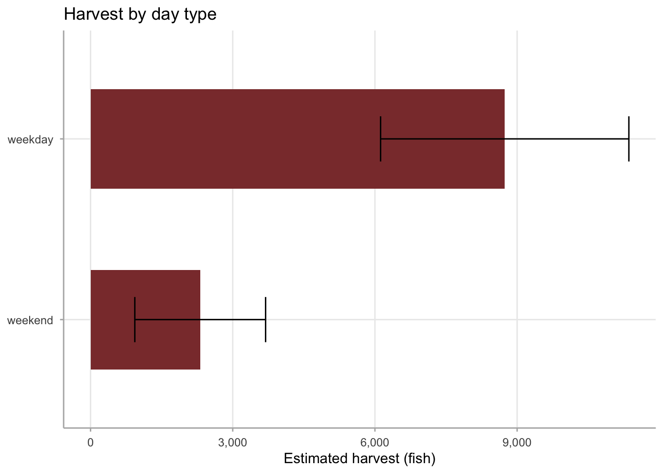
When harvest differs substantially between strata, a stratum breakdown informs allocation decisions — both for future sampling and for management. A grouped bar chart with CIs shows both the stratum totals and their uncertainty.
Code
harvest_by_stratum |>mutate(day_type =fct_reorder(day_type, estimate)) |>ggplot(aes(x = estimate, y = day_type)) +geom_col(fill ="#8B3A3A", width =0.55) +geom_errorbarh(aes(xmin = ci_lower, xmax = ci_upper), height =0.25) +scale_x_continuous(labels = scales::comma) +labs(x ="Estimated harvest (fish)", y =NULL,title ="Harvest by day type") +theme_creel()
`height` was translated to `width`.
Figure 27.4: Estimated all-species harvest at Harlan Reservoir in 2022 by day type, with 95% confidence intervals. Weekday harvest substantially exceeds weekend harvest, consistent with weekday dominance in total effort. The wide confidence intervals reflect that harvest is estimated as a product of two random quantities (effort and per-trip harvest rate), compounding variance from both sources.
27.3 CPUE visualization
CPUE plots show catch rate rather than totals, making them suitable for comparisons across time periods or angler groups where effort differs. The key design principle is the same: always show the confidence interval. A forest plot — a point-and-range display with one row per domain — is the standard format for comparing CPUE across multiple levels of a grouping variable. See Section 23.2 for estimator choices.
CPUE by angler type
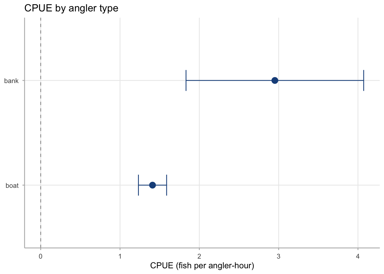
A forest plot comparing CPUE across angler types (bank versus boat) is one of the most common creel survey outputs. The horizontal layout with sorted rows makes the ordering clear without requiring the reader to scan a legend.
Figure 27.5: Walleye CPUE at Harlan Reservoir in 2022 by angler type, with 95% confidence intervals. Bank anglers recorded a substantially higher CPUE than boat anglers, indicating that bank-accessible areas of Harlan held higher densities of catchable Walleye per unit of angling time during the 2022 season.
CPUE forest plot across multiple domains
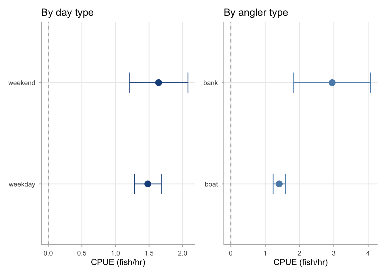
When comparing CPUE across many levels — such as angler type and day type together — a faceted or combined forest plot avoids cluttered grouped bar charts. Patchwork assembles multiple forest plots into a single figure.
`height` was translated to `width`.
`height` was translated to `width`.
Figure 27.6: Walleye CPUE at Harlan Reservoir in 2022 by day type (left) and angler type (right), with 95% confidence intervals. Weekend CPUE slightly exceeds weekday CPUE, though the difference is within sampling uncertainty. The angler-type comparison shows a more pronounced difference, with bank anglers recording higher CPUE than boat anglers.
27.4 Species CPUE visualization
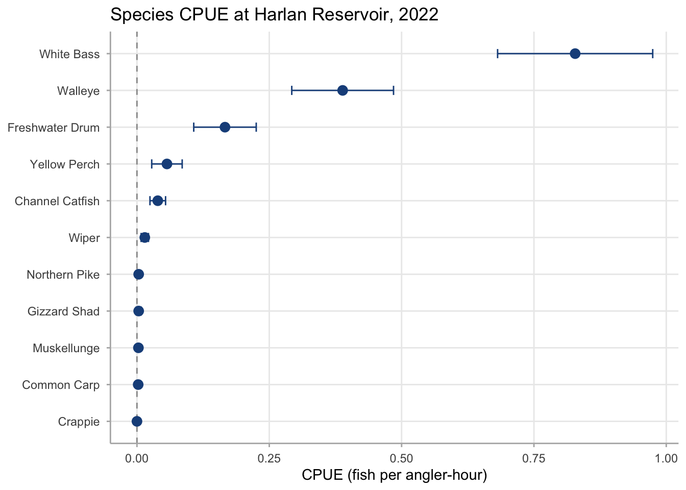
Species-level CPUE plots communicate the composition of the catch in rate terms, making them more comparable across surveys with different effort levels than raw count tables. Ordering species by estimated CPUE and including confidence intervals is essential: low-CPUE species often have intervals that span zero or near-zero, which should be visible rather than hidden by a table.
Figure 27.7: Species-specific CPUE at Harlan Reservoir in 2022 for six common species, with 95% confidence intervals. White Bass and Walleye dominate the catch by rate, consistent with their abundance and catchability in Harlan’s warm, productive waters. Bluegill and Largemouth Bass have the lowest estimated CPUEs among the species shown; the widths of their confidence intervals relative to their point estimates indicate that these estimates carry proportionally high uncertainty.
Two patterns are immediately visible: White Bass and Walleye dominate the catch by rate, and the four lower-CPUE species have confidence intervals that are wide relative to their point estimates. The practical implication is that species with very low CPUE — those in the tail of the distribution — often cannot be estimated precisely from a standard creel design that was sized for the dominant species. Targeted subsampling or stratified sampling by location can improve precision for low-CPUE species if they are of management interest.
27.5 Precision diagnostic visualization
Precision plots communicate the reliability of estimates rather than the estimates themselves. They are most useful during survey planning (to justify sample sizes) and in reporting (to help managers understand which estimates should drive decisions and which carry too much uncertainty to act on). See Section 25.1 for the precision framework.
CV profile across metrics
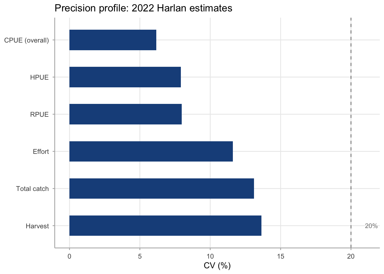
A CV profile plot shows the coefficient of variation for each key metric, making it easy to see at a glance which estimates are most and least precise. A horizontal reference line at the agency’s target CV (commonly 15–20%) anchors the interpretation.
Code
bind_rows(tibble(metric ="CPUE (overall)", est = cpue_overall$estimate,se = cpue_overall$se),tibble(metric ="Effort", est = effort_overall$estimate,se = effort_overall$se),tibble(metric ="Harvest", est = harvest_overall$estimate,se = harvest_overall$se),tibble(metric ="Total catch", est = catch_overall$estimate,se = catch_overall$se),tibble(metric ="HPUE", est = hpue_overall$estimate,se = hpue_overall$se),tibble(metric ="RPUE", est = rpue_overall$estimate,se = rpue_overall$se)) |>mutate(cv = se / est *100,metric =fct_reorder(metric, -cv)) |>ggplot(aes(x = cv, y = metric)) +geom_vline(xintercept =20, linetype ="dashed", colour ="grey50") +geom_col(fill ="#1B4F8A", width =0.55) +annotate("text", x =21, y =1, label ="20% guideline",hjust =0, size =3, colour ="grey50") +labs(x ="CV (%)", y =NULL,title ="Precision profile: 2022 Harlan estimates") +theme_creel()
Figure 27.8: Coefficient of variation (CV, %) for key Harlan Reservoir estimates in 2022. CPUE, HPUE, and RPUE all achieve CVs below 10%, reflecting the ratio estimator’s efficiency in smoothing between-day variation in catch rates. Effort, total catch, and total harvest carry higher CVs (approximately 12–14%) because count-based expansion compounds between-day variance in angler density. All estimates fall below the 20% guideline commonly used for management-grade creel data.
Comparing CPUE and HPUE precision
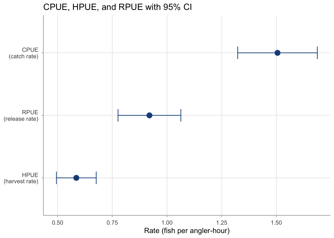
When both CPUE and HPUE are reported, a side-by-side point-and-range display helps readers see that harvest-based rates are typically less precise than catch-based rates — because harvest trips are a subset of all completed trips, reducing the effective sample size.
Code
bind_rows(tibble(rate ="CPUE\n(catch rate)", est = cpue_overall$estimate,lower = cpue_overall$ci_lower, upper = cpue_overall$ci_upper),tibble(rate ="HPUE\n(harvest rate)", est = hpue_overall$estimate,lower = hpue_overall$ci_lower, upper = hpue_overall$ci_upper),tibble(rate ="RPUE\n(release rate)", est = rpue_overall$estimate,lower = rpue_overall$ci_lower, upper = rpue_overall$ci_upper)) |>mutate(rate =fct_reorder(rate, est)) |>ggplot(aes(x = est, y = rate)) +geom_errorbarh(aes(xmin = lower, xmax = upper),height =0.2, colour ="#1B4F8A") +geom_point(size =3.5, colour ="#1B4F8A") +labs(x ="Rate (fish per angler-hour)", y =NULL,title ="CPUE, HPUE, and RPUE with 95% CI") +theme_creel()
`height` was translated to `width`.
Figure 27.9: Overall CPUE, HPUE, and RPUE at Harlan Reservoir in 2022 with 95% confidence intervals. CPUE has the narrowest confidence interval in relative terms (lowest CV at approximately 6%), reflecting the ratio estimator’s efficiency across the full catch. HPUE and RPUE carry modestly higher CVs (approximately 8%) because harvest and release subsets are more variable across trips than total catch.
27.6 Multi-year overview visualization
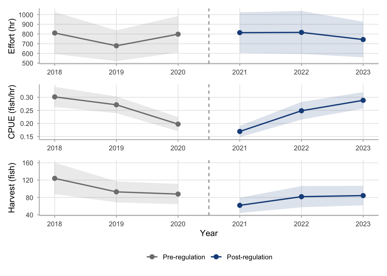
When monitoring data span multiple seasons, a three-panel overview figure combining effort, CPUE, and harvest is often the most compact way to present a full monitoring series. The panels share the same x-axis (year) and a common color scheme for the regulation period, allowing a manager to read the key story across all three metrics simultaneously. This is the format used in Section 31.1; the code is reproduced here as a gallery template.
Figure 27.10: Three-panel monitoring overview for Harlan Reservoir Walleye, 2018–2023, combining annual effort (top), CPUE (middle), and harvest (bottom) with 95% confidence intervals. All three panels share the same x-axis and color scheme: gray for pre-regulation years (2018–2020) and dark blue for post-regulation years (2021–2023). Reading the three panels together reveals the complete monitoring story: stable effort, transitional CPUE decline followed by recovery, and a sustained post-regulation harvest reduction.
The three-panel layout works best when all three metrics are needed and the reader is a manager familiar with creel survey outputs. For stakeholder communications where one metric dominates the story — such as a harvest reduction after a size limit change — a single panel with annotation is often cleaner than three panels that require mental integration. Adapt the layout to the audience and the management question being answered.
27.7 Quick reference: plot types and when to use them
The table below summarizes the key plot types in this chapter and their appropriate contexts. Each row maps a visual goal to the recommended geometry and the chapter where the underlying estimator is introduced.
Two formatting rules apply across all plot types in this chapter:
Always show uncertainty. An estimate without a confidence interval communicates false precision. Managers and reviewers should be able to see whether two estimates are distinguishable from each other or whether the data are consistent with no difference.
Sort by estimate, not alphabetically. When showing multiple domains — species, angler types, strata — ordering the rows by the point estimate makes the ranking immediately legible. Alphabetical ordering forces readers to scan for the largest and smallest values rather than reading directly from position.